UI Review: maula-zee-nu.vercel.app
Reviewed 2026-10-17 on the live site (Home, Projects, About, Blog) at 1280×800 and 390×844 (iPhone 12 Pro), light and dark. Values below come from computed styles in the running page, so there are no file:line references. This is a deployed site and I had no source.
Verdict: Blocked
The design is strong: good type scale, sensible dark mode, a clear identity. It is blocked on the accessibility floor. Four things break it: tap targets, secondary-text contrast, an unlabelled 14px search field, and decoration that makes real copy unreadable in light mode.
Blocking
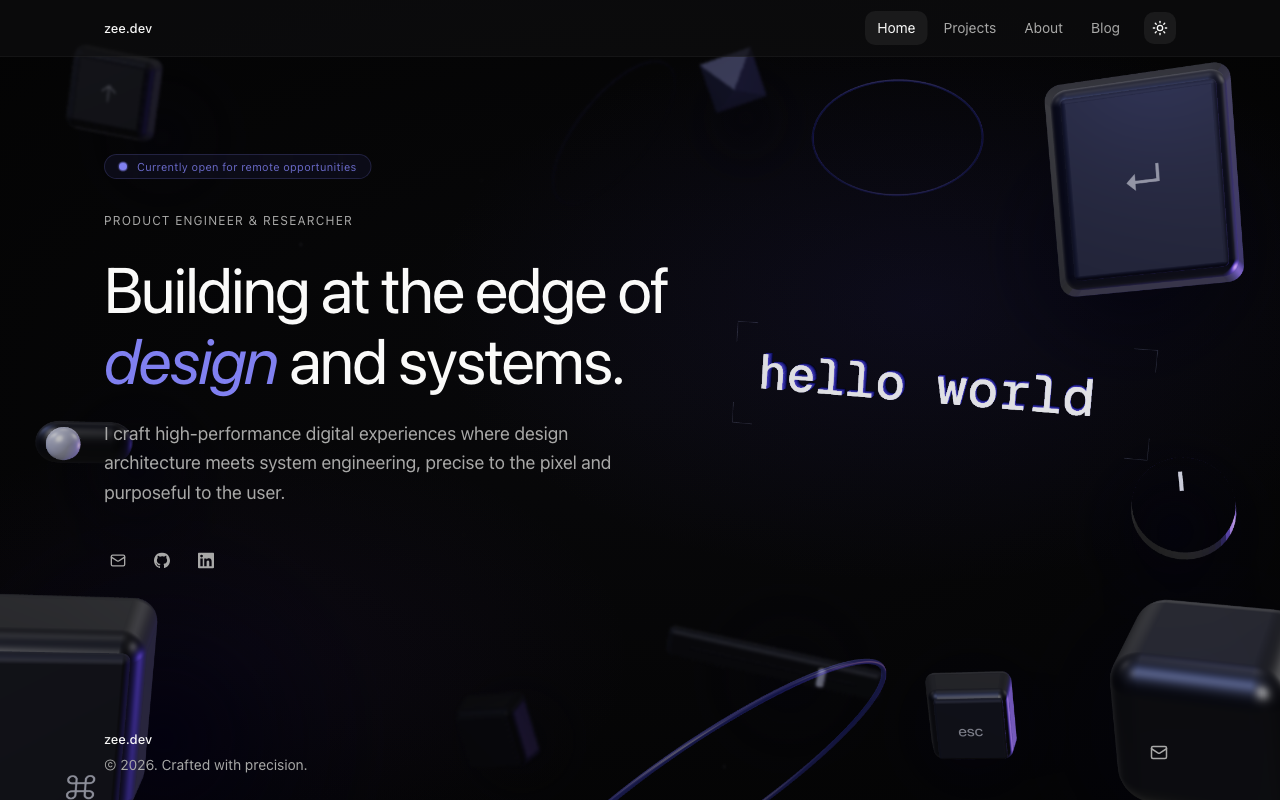
1. The 3D scene covers real text, mostly in light mode and on mobile
Dimension: layout / contrast · emil-ui-polish, emil-color
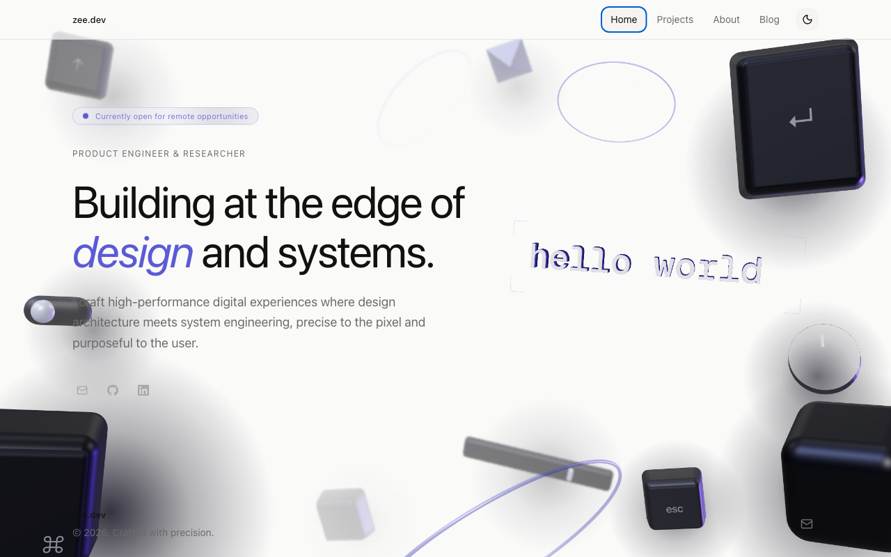
The fixed .floating-scene (z-index -10) sits behind content, but the dark keycaps and shadow blobs are the same tone as the text laid over them.
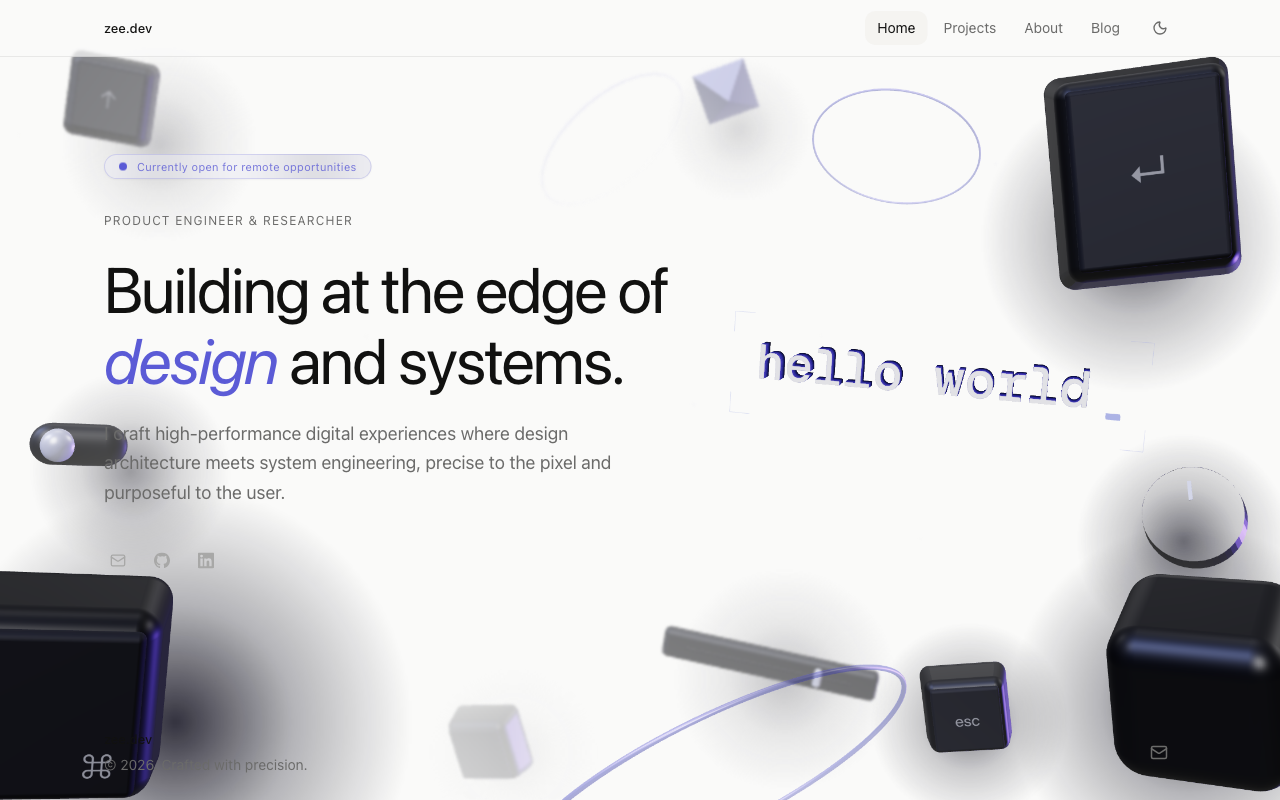
- Desktop light: the footer
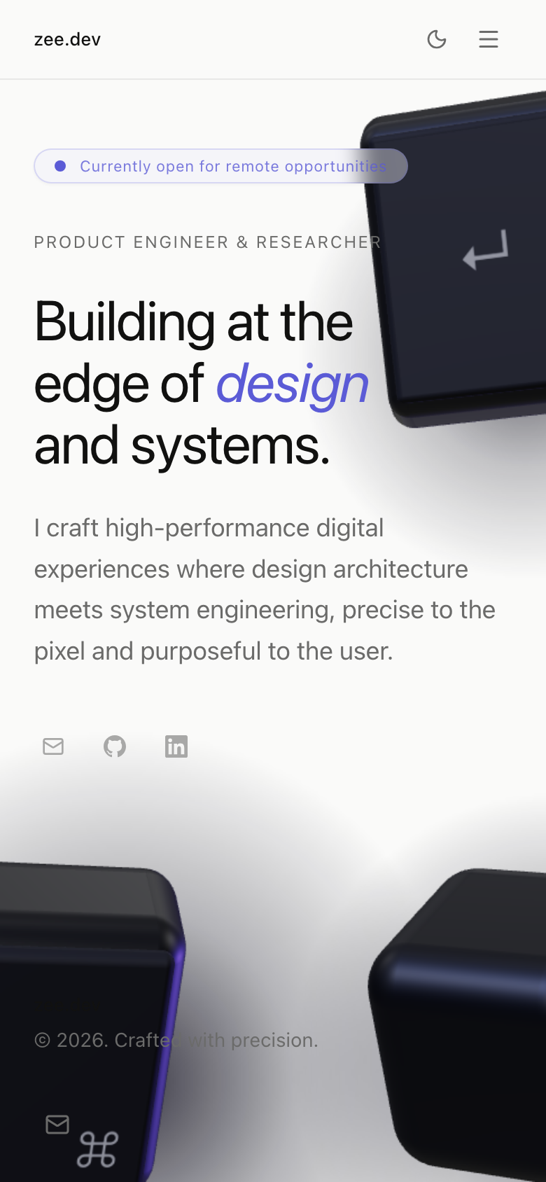
zee.devand "© 2026. Crafted with precision." sit on a dark keycap and half disappear. A toggle-switch object also touches the first word of the hero paragraph ("I craft…"). - Mobile: the
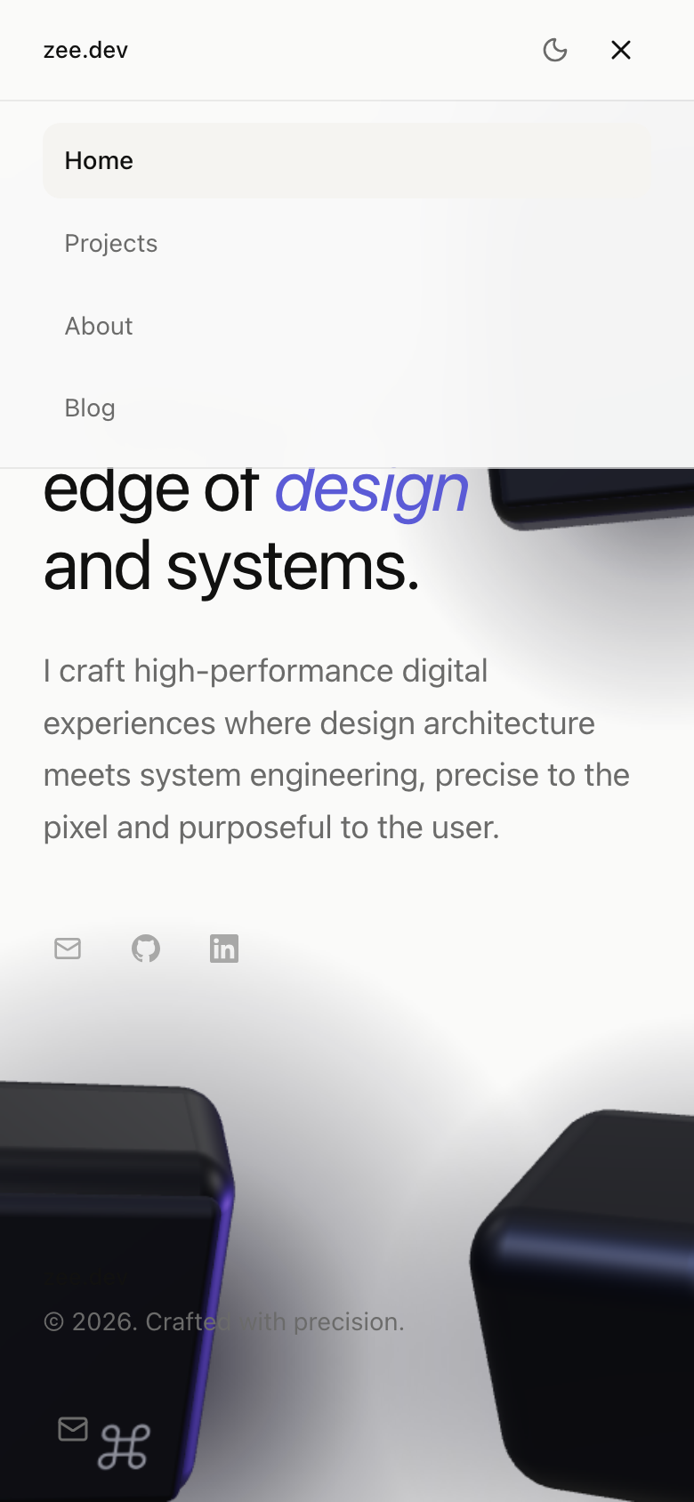
↵keycap runs under the "Currently open for remote opportunities" badge and the "PRODUCT ENGINEER & RESEARCHER" eyebrow. "Crafted with precision." is cut by a keycap. - Dark mode: the same footer text is readable, so the problem is light-mode only.
Fix:
- Keep scene objects out of text columns. Position them by breakpoint, or mask or fade them where text lives.
- Raise the footer above the scene with a surface behind it: isolation: isolate plus a solid or bg-white/80 footer.
- On mobile, show fewer or smaller objects.
2. Tap targets are under 44×44
Dimension: accessibility floor · emil-touch-and-accessibility
| Control | Size |
|---|---|
| Hero social icons (Email / GitHub / LinkedIn) | 28×28 |
| Footer social icon | 34×34 |
| Theme toggle | 32×32 |
| Mobile menu toggle | 34×34 |
| Desktop nav links | 62–77 × 34 |
| Blog filter chips | 41–97 × 35 |
| Project card title links | ~83×26 |
The card links are probably stretched by ::after, so the whole card is hit-testable. Everything else is not.
Fix: keep the visual size and expand the hit area. Use relative before:absolute before:-inset-2.5 before:content-[''] on the icon buttons, or add padding to reach 44. The social icons are the worst offenders, at 28px and visually pale.
3. Secondary text fails contrast (2.3:1)
Dimension: accessibility floor · emil-color
- Project card year ("2026"):
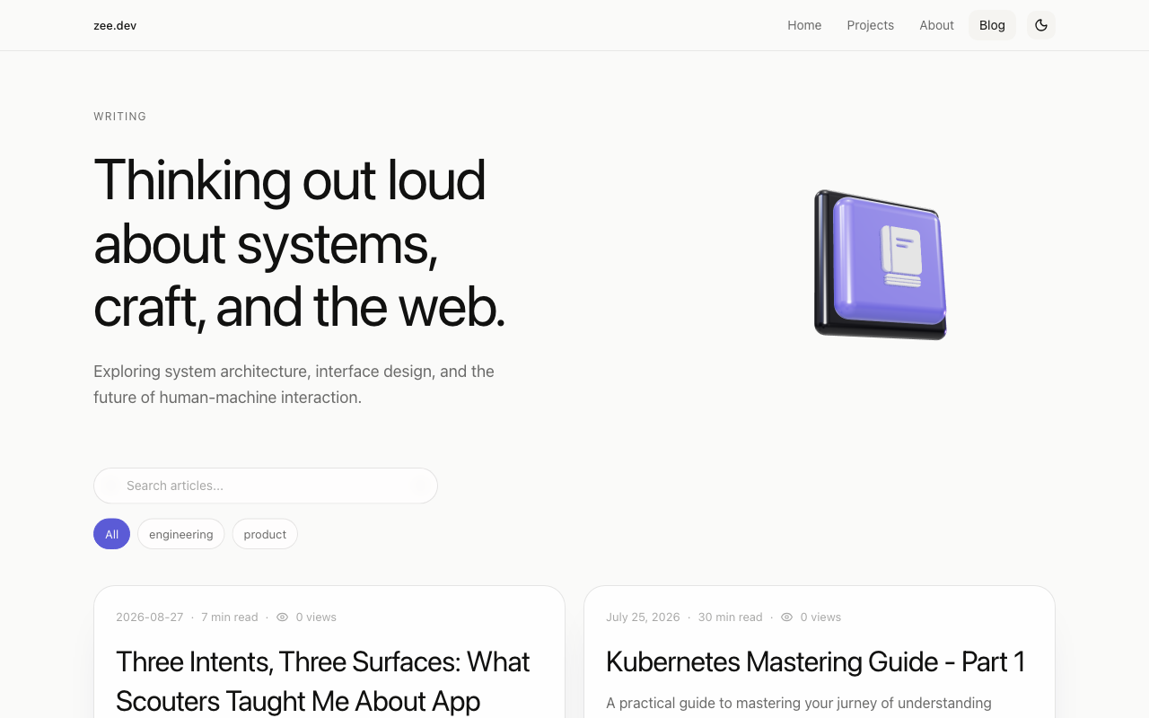
rgb(168,168,167)on white, 2.38:1. - Blog meta (date · read time · views): same colour on
#fafaf9, 2.28:1. - Search placeholder uses the same grey.
- Required: 4.5:1 for 13px text.
Fix: move this token to roughly oklch(0.52 0 0) (~#6b6b6a, already the nav secondary colour at 5.1:1). Re-check dark mode.
4. Blog search field: 14px, no label, no focus style
Dimension: interaction / forms · emil-forms-and-inputs
<input>is 14px, so iOS Safari zooms the page on focus. The minimum is 16px.- No
<label>and noaria-label. The placeholder is the only name, and it is the low-contrast grey from #3. outline: noneandbox-shadow: nonein the focused-computed state, so I could not find a visible focus indicator on the field. Verify by tabbing in.- The search icon inside the field is nearly invisible (see screenshot above).
Fix: text-base (16px), aria-label="Search articles", :focus-visible ring, type="search", autocomplete="off", spellcheck="false".
Should fix
5. Blog filter chips don't expose state
All / engineering / product have no aria-pressed (or role="tab"/aria-selected). Screen-reader users can't tell which filter is active.
Fix: aria-pressed={active}.
6. Sticky header lets page text bleed through
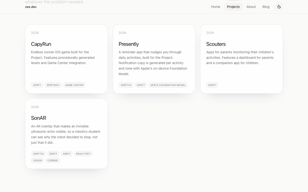
Scrolled down on Projects, the paragraph "whatever the problem needed." shows through the glass header and collides with zee.dev.
Fix: raise the header's background opacity (≥ 0.85) or a bigger blur (backdrop-blur-xl) and a bottom border. Test over dense text, not just the hero.
7. Focus ring is the browser default
Tabbing works, since "Home" gets Chrome's rgb(0,95,204) auto 1px ring. There is no :focus-visible rule in the stylesheet. On a site this considered, the default blue ring clashes with the indigo accent, and it will vary across browsers.
Fix: a single global :focus-visible { outline: 2px solid var(--accent); outline-offset: 2px; }, with border-radius: inherit for pills.
8. Hover is not gated behind (hover: hover)
There are zero @media (hover: hover) rules. The card hover:border-* and any hover transforms will stick after a tap on touch devices.
Fix: wrap hover-only styling in @media (hover: hover) and (pointer: fine). Tailwind v4 does this by default; v3 needs future.hoverOnlyWhenSupported.
9. About portrait is under-resolution
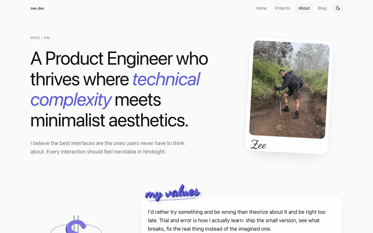
<img alt="Portrait of Zee"> has a natural size of 288px and renders at 260×326 CSS px. On a 2× display it is upscaled to ~520px of device pixels and looks soft. loading="auto".
Fix: export at ≥ 560px wide (or 3× source), use next/image with sizes, and set width/height to prevent shift.
10. Orphaned fourth card on Projects
4 projects in a 3-column grid leaves one card alone in row two with a large empty area. Not wrong, but it reads as unfinished.
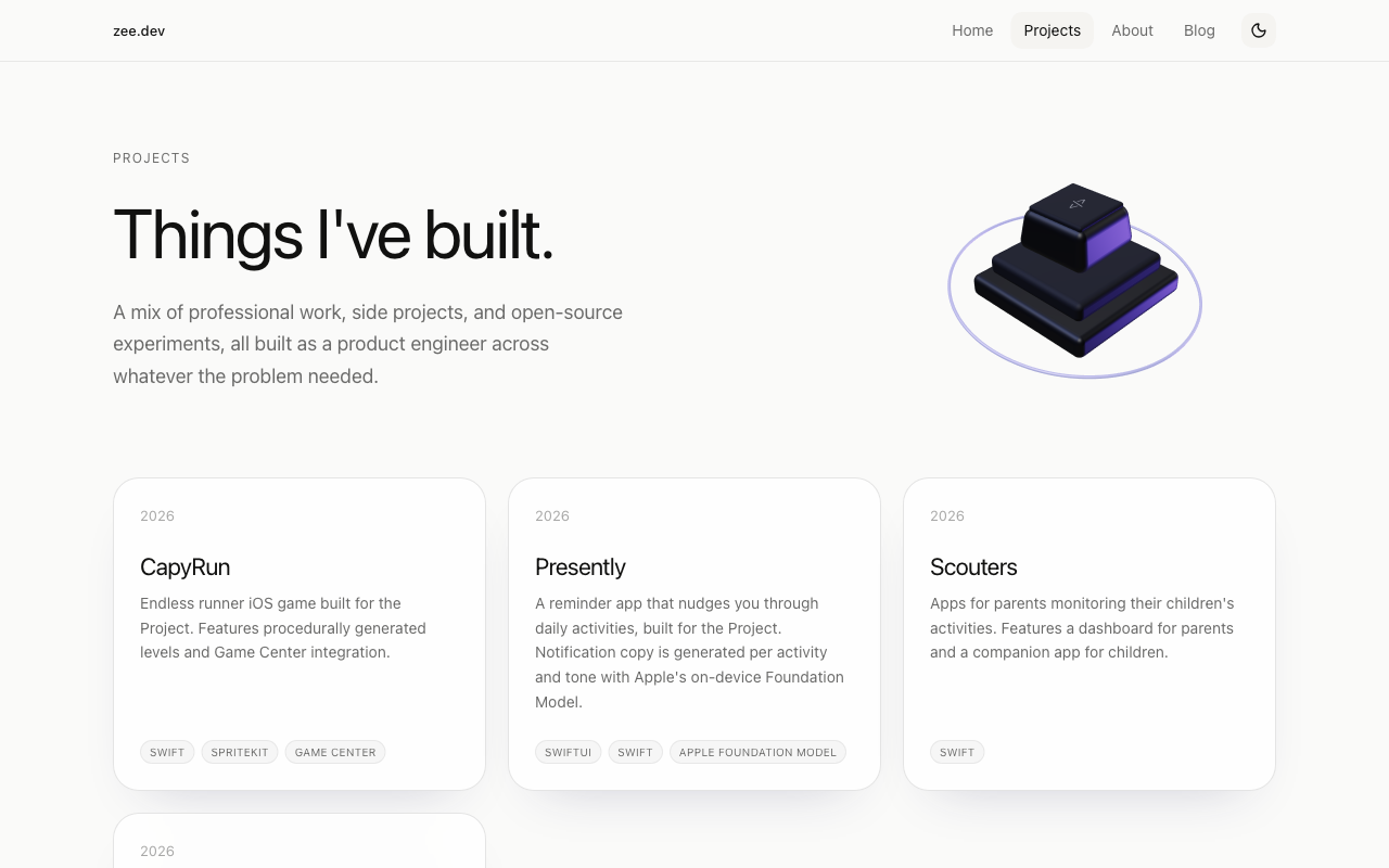
Fix: a 2-column grid at this count, or a featured first card spanning 2 columns.
Nits (optional)
- Copy bug: Projects descriptions say "built for the Project" (CapyRun, Presently). Looks like a dropped name or placeholder. Fix or delete.
- Date format is inconsistent on Blog:
2026-08-27on one card,July 25, 2026on the next. Pick one. - "0 views" is shown on every post. Hide the count until it's meaningful.
- Tabular numbers: none (
font-variant-numeric: tabular-numsabsent). Matters if views or read time update live; low risk today. font-synthesisis the default (weight style small-caps). Setfont-synthesis: noneso a missing italic fails visibly. The italic accent word ("design", "technical complexity") is the one place it would show.- Theme default: the site stays light even when the OS or browser says dark; it only changes via the toggle (stored in
localStorage). Consider defaulting toprefers-color-scheme. - Dark background is
#0e0e0f(not pure black). Good. - Card hover transition is
0.3sontransform. This is at the edge of the budget; drop to ~200ms. - Mobile menu:
Toggle menuhas noaria-expanded, and the panel snaps open. Addaria-expandedandaria-controls.
What's already right
- H1 uses
text-wrap: balance, 64px / 70px leading with −1.6px tracking. This is correct large-heading treatment. - Body is 16px with 1.6 leading, and line length stays about 65–75 characters.
- Icon-only buttons are labelled (
Toggle theme,Email,GitHub,LinkedIn,Toggle menu). - A global
prefers-reduced-motionrule exists, and 5 JS chunks reference the media query, so the 3D scene likely honours it. I couldn't toggle it here, so treat that as unverified. - No
transition: all, no random z-index (only50and-10), no horizontal scroll at 390px. - Dark mode is a designed surface set, not an inversion, and the scene looks better in it.
Not verified
prefers-reduced-motionbehaviour of the 3D scene (the media query can't be emulated here).- Frame rate and GPU/battery cost of the WebGL scene on a real phone. The page loads ~1.4 MB of JS uncompressed.
- A blog post detail page and a project detail page.
- Whether the blog search input shows any focus indicator when actually focused, since I read computed styles but didn't screenshot it.